
Here are a few of the dashboards I have created. The illustrations below are designed to provide an overview without revealing specific client data. Each dashboard provides a wealth of interactivity and different views when viewed live.
|
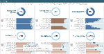
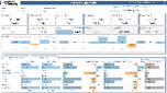
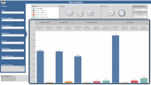
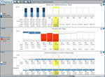
McGraw Hill The Admin dashboard is a proof of concept dashboard used by Admins within schools to identify at risk students and understand how the performance strategy is being enacted within the school. |
|
|
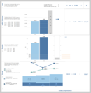
Bain Capital The EC2 Instances dashboard allows senior management understand their server portfolio including availability both current and over time. |
|
|
Bain Capital The Change Ticket Requests dashboard allows senior management to assess where change tickets are arising,their severity and cadence.. |
|
|
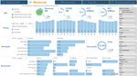
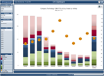
Harvard Business Publishing The Subscriptions Gained: Trend Analysis dashboard provides valuable insight as to changes in key segments of subscription markets utilizing eye catching design elements. |
|
|
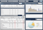
Harvard Business Publishing The Forecast Summary dashboard allows senior management to see changes in key finance metrics over user selected time periods as well as regional revenue distribution. |
|
|
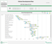
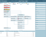
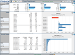
Sunovion The Clinical Development Plan dashboard illustrates pharmaceutical product development timelines along with critical milestones whilst allowing the user to sort and filter based on a variety of dimensions and metrics . |
|
|
MBTA The Case Analysis dashboard illustrates Covid-19 cases across the MBTA workforce and allows users to understand distribution, severity and timelines associated with cases. |
|
|
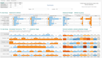
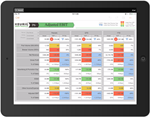
MBTA The Support Call Volume dashboard illustrates support incidences across MBTA showing timeline, volume, categorization and location. |
|
|
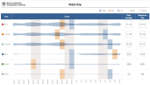
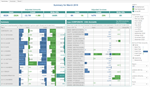
MBTA The Schedule Bids dashboard illustrates the various states of workforce requests for work periods. |
|
|
MBTA The Employee Diversity dashboard illustrates gender breakdown, location, chronology and ethnic diversity. |
|
|
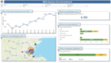
MBTA The Ridership dashboard illustrates passenger volume over time broken out by individual metro line with averages and peak volume.. |
|
|
MBTA The Capital Delivery dashboard is used by senior management to track and understand all Capital current, forecasted and future expenditure across MBTA. |
|

|
MBTA The Map dashboard is used to illustrate a methodology of displaying colored and sized circles on a standard MBTA route map, using only basic, out of the box Tableau capabilities. |
|
|
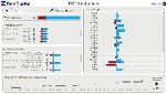
Stewart Medical The Compensation dashboard is used to illustrate various complex aspects of a doctors' compensation package. |
|
|
Unifirst The AR dashboard is used to view AR from an overall company level and drill through each level of the organization to ultimately view each invoice in detail. |
|
|
Unifirst The Employee dashboard is used to understand headcount and attrition across the organization and drill through various levels down to each individual and their various pay components. |
|
|
Unifirst The Credits & Write Offs dashboard is used to understand how credit is assigned to customers at each level within the organization on both a pre and post invoice level. |
|
|
Akamai The Akamai Facts & Figures dashboard is used by C-level executives to view key KPI's and quickly access key facts and figures prior to onsite visits and presentations. |
|
|
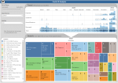
Cell Signalling Technology The Product Pipeline dashboard is used by executives to asses project portfolio mix and understand project flow throughout the organisation. |
|
|
Keurig The Finance dashboard is used by executives to view key performane indicators across the organisaton using a PNL based visualization. |
|
|
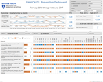
Brigham Womans Hospital The CAUTI dashboard is used by executives through to nurses to understand outcome metrics around catheter infections and their supportig process metrics. |
|
|
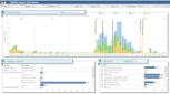
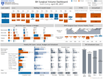
Brigham Womans Hospital The Surgical Volume dashboard is used to view Surgical Volumes over a rolling 13 month trend, fiscal YTD and Annualized. Volumes are displayed as trend arrows as well as broken down by Department and Service. |
|
|
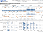
Brigham Womans Hospital The Block Utilization dashboard is used to view Block Utilization percentages across Departments and Services along with monthly trends and Case volumes. |
|
|
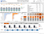
Brigham Womans Hospital The Emergency Department Statistics dashboard is used to view weekly trend, YTD Overview, wait times and patient volumes. With color coding to draw attention to areas requiring attention. |
|
|
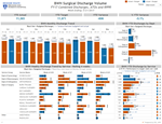
Brigham Womans Hospital The Surgical Discharge Volume dashboard is used to view Actual vs Target volumes across Service Group and Service Name. |
|

|
Mylan Pharmaceuticals The Executive Dashboards provide an at-a-glance view of key performance indicators and their trends across three corporate views; Commercial, Functional and Vertical. The dashboards are used by the CEO to gain a high level understanding of the KPI's and to use these during management meetings. |
|
|
PSCU The PerformanceVue product rolled out to PSCU's 600+ member credit unions, contains three dashboards, Credit, ATM and Debit embedded within a .Net framework. Each segment displays multiple graphs, which the user can shrink to reveal tabular data below. |
|
|
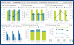
Capital Blue Cross The Clinical Performance Dashboard illustrates overall Cost, PMPM, Utilization and Utilization per 1,000 members and then allows an ACA manager to filter to specific item combinations and drill into any Category and Breakout combination. |
|
|
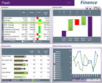
Natixis The Flash Dashboard provides high level corporate health status in a company standard form. Graphics provides an indication of value before, gains, losses and value after juxtaposed against forecasted gains, losses and value after. |
|
|
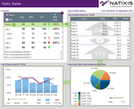
Natixis The Daily Sales illustrates fund performance overall, top 10, bottom 10 and watched funds. Additional graphics illustrate performance for selected funds overall multiple timeframes and portfolio makeup. |
|
|
Finance company in Boston The CIO Dashboard illustrates staffing mixes within each coporate division compared against company averages. Performance improvement is fostered by each SVP comparing their performance against their peers. |
|
|
Finance company in Boston The Summary Dashboard illustrates overall performance over time for Assets, Trades and Flows including current performance. Further analysis is invoked by selecting a more detailed dashboard to launch from the available options. |
|
|
Finance company in Boston The Flows Dashboard provides a more detailed flows analysis for the analyst who has selected flows details from the above summary dashboard. |
|
|
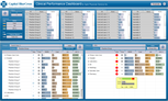
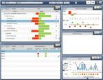
Southern California Edison The Performance Dashboard illustrates how many KPI's are "past" the target, organized by hierarchical groups. Trend group & individual KPI over time. View key factors associated with performance bonus payout & how they are trending towards the final yearly result. |
|
|
Southern California Edison The O&M Dashboard illustrates Actual, Forecast & Variance as the user drills into each business level. A parallel drill hierarchy offers an alternative view by business category. |
|
|
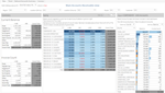
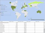
Volkswagen The Region Analysis portlet allows the business user to visualize regional Labor, Parts, Extra and Total Costs based on a user adjustable slider control. Specific values are provided within a table. Embedded within a portal. |
|
|
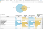
Land O' Lakes The Sales Analysis portlet allows the business user to select & compare two customer groups by Category, Product Line, Year & Sold/Unsold and view their relative dollar values. A detailed customer list is exported to Excel. Embedded within a portal. |
|
|
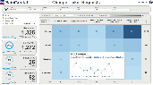
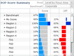
Marketforce The Scorecard illustrates each departments percentage score and compares it to overall departmental benchmark scores. The business users graphically drills down the business hierarchy. Embedded within a portal. |
|
|
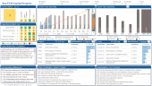
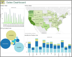
Sales Dashboard The Sales Dashboard provides Weekly, Monthly, YTD by State and Product Line sales totals in an engaging and attractive dashboard that is easy to understand and provides a quick way to understand sales totals. |
|
|
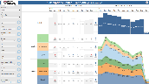
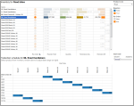
Inventory Dashboard The Inventory Dashboard provides a quick view into product stock levels for the user selected product line. The user chooses a product and views a chronological display to see the scheduled production runs and expected quantity yields for the selected product. |
|